Olympic rage

I have spent seven years defending the London Olympics to everyone who thinks they are a terrible waste of money and effort. “The Olympics”, I have said more than once, “are the only time when the nations of the world come together in an activity which isn’t a war. They represent the best of human society and endeavour, and we should celebrate them”.

I still think that, but Londoners have been exposed to an increasing amount of games-related publicity in the last few weeks, and I think I’ve finally snapped. It’s not the solemn entreaties to walk or cycle instead of taking public transport this summer (although unless you’re going to refund some of my £160 monthly travel costs, Boris, you can fuck right off with that suggestion); nor is it the utter mess they made of ticketing (although I’m separately angry about that). No: the reason my stomach clenches every time I see one of the posters is the unutterably hideous font they’re using to promote the event.

Look at it:

London Olympics text

It looks exactly like the kind of design I used to come up with, freehand, when as a teenager I briefly thought that I might like to be a graphic designer. It was the fact that my fonts looked like this that made me realise I wasn’t good enough. It’s ugly, it’s difficult to read, and most of all it looks half-finished, like a placeholder that’s being used as a joke to remind the designer to replace it with a proper font before he sends the proofs over.

But it’s not a joke, or a placeholder: it’s the font that somebody, somewhere – possibly, even, a committee – has decided should be used to showcase British design talent on the biggest, brightest stage of them all. I feel ashamed every time I look at it, and you know what? I could absolutely have done a better job.

(Also terrible: the logo, which I have ranted about elsewhere, and the mascots, which are so bizarrely awful that I almost can’t bring myself to mention them at all, but just for comparison, here is Misha, the mascot of the 1980 Moscow Olympics. Misha, for the avoidance of doubt, is a bear:

Misha the Olympic bear

…and here are Wenlock and Mandeville, the mascots of the 2012 London Olympics:

wenlock and mandeville

Wenlock and Mandeville are, uh, they’re…aliens? In…cycle helmets? Cute! I want one!

Still, at least they aren’t named after a small-town law firm. Oh.)

Blue sky thinking

sky-coloured lighting

Sorry, that’s a truly terrible title for this post, but I’m at work so I have to write quickly. I am lucky because my new office has lots of windows, and I honestly think that daylight helps you (or, at least, me) to concentrate, which is why I would always have a desk facing outwards if I could. But in the absence of that, and since the beloved is yet to write the bestselling novel which means neither of us will ever need to work again, the next best thing is probably this sky-mimicking ceiling lighting from (naturally) Germany. It’s €1,000 per square metre at the moment. Donations welcome.

Gadgets

I’ve just been reading a piece on The Next Web called The 7 Most Beautiful Gadgets ever made. It’s a necessarily subjective judgement, of course, but I can’t help feeling it was written by someone with an eye for function over form. The Sony PS3 is an impressive beast, if that’s your bag, but beautiful? Never.

Maybe the problem is that when it comes to technology, we’re not very good at aesthetics. It took the arrival of tablets on the mass market for us to realise that everything we’ve ever done on the web is ugly, and that it’s possible to present digital content in a beautiful way. Why we have managed to do this with apps but not with websites is a mystery I haven’t solved (update: see the first comment for a good answer to this), but I’d like to think that we’ll catch up with ourselves eventually and start making everything beautiful.

But in the meantime, we can try to stop confusing how stuff looks with what stuff does. For Le Corbusier and the modernists, beauty was in usefulness, and the most beautiful thing was the thing that worked most perfectly. But then where would you classify an umbrella, which is beautiful and conceptually brilliant and only works if it rains directly downwards and there’s no wind? I think you have to allow for different versions of beauty, because form and function don’t always work in perfect harmony. So I have made two lists: the seven most beautiful gadgets ever made, and the seven best-designed gadgets ever made. There is no crossover, although I suspect my definition of “gadgets” gets a bit expansive towards the end.

The seven most beautiful gadgets ever made

7. The glass kettle
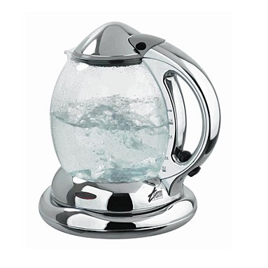
Glass kettle

I had one of these in the first flat I lived in after I left university, so for me it is the very symbol and essence of grown-up-ness. Of course, if you live in London it gets scaly and ugly after five minutes, but in its pristine condition it is a lovely thing, and watching water boil through glass is about as mesmerising as watching fire burn.

6. The spout bottle opener

Spout bottle opener

Most bottle openers are functional. This bottle opener is functional, but it’s also beautiful. I would like to live in a world where everything was as sleek and shiny as this.

5. The gramophone

A gramophone

I wish we still listened to music on these. I would have one in every room.

4. The iPod classic

iPod classic

Yes, I know they have gotten smaller and better since the original, but this is genuinely a design classic. The TNW piece includes the iPhone, which is arguably the most influential piece of design of the last decade, but that doesn’t make it the prettiest. iPhones are clunky and ugly. The first iPod was stunning, and just because it got smaller doesn’t mean it got better, aesthetically speaking. The Mona Lisa wouldn’t be better if it were smaller.

3. The Fender Stratocaster
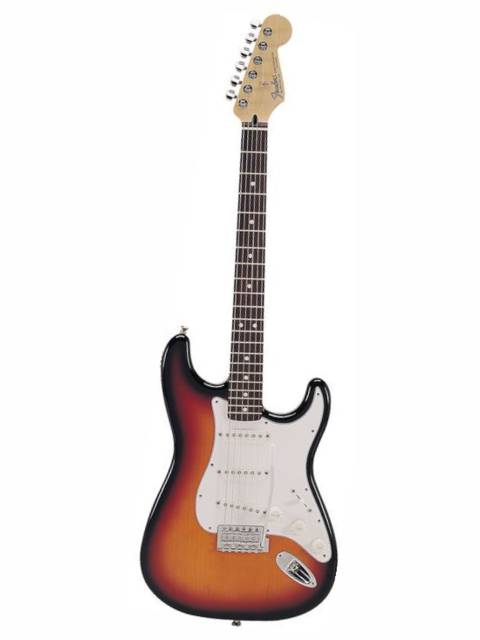
A Fender Stratocaster

Another perfect piece of design. I could have done a whole list of musical instruments – have you ever seen anything as beautiful as a violin, or a saxophone, or a grand piano? – but the Fender Strat won out. Look at those lines. And yes, I know a guitar isn’t really a gadget, but I figure if TNW can have a car, I can have a guitar.

2. The Motorola RAZR

Motorola RAZR

You can’t fully appreciate the beauty of a RAZR from photos. I had two RAZRs in a row – I can’t remember what happened to the first one – and I loved them like you love a pet, even though they didn’t really work. It didn’t matter that they didn’t really work, because they looked and felt so perfect. It’s the only phone I’ve ever owned that would make people squeal when they first saw it, and although it might be obsolete in terms of technology, it’s still far and away the best-looking phone I’ve ever seen.

1. The arc light

arc lamp

Yeah, I’m not sure it’s a gadget either. But, well, it has electricity. Also, I just wanted an excuse to publish a big picture of an arc light. Impractical for all but the largest room, ridiculously proportioned and impossible to combine with any normal furnishings, it is the very epitome of form over function, and it’s one of the most perfect things I’ve ever seen.

The seven most perfectly functional gadgets ever made

7. The tea strainer

6. Velcro

5. The ring pull

4. The pencil

3. The zip

2. Scissors

1. The wooden spoon

(Actually, you can get beautiful versions of all of those things, too.)

I would love to know what your nominations for either list would be.
Olympic countdown

I walked past the Olympic countdown clock in Trafalgar Square this morning:

Olympics countdown clock

It went up last night and it will count down the 500 days until the London Olympics begin next August. I walk across Trafalgar Square every weekday, so I’ll be able to keep a close eye on it and make sure nobody’s cheating.

Tickets for the various Olympic events also went on sale today. The process for buying them seems complicated, excluding and unfair, but I’m still going to try to get hold of some, which I suppose is what they’re counting on. If you have a monopoly on a hugely popular commodity, you can pretty much do what you like with it.

It’s disappointing that the ticket sales mechanism is so badly-designed, but not as disappointing as the design of that logo. Have another look at it:

London 2012 logo

I mean, what? It doesn’t even look like anything. It certainly doesn’t look like the numbers “2012”, unless you squint really hard. When it was first unveiled four years ago we were assured that we’d get used to it. Tessa Jowell, my MP and at that time the Olympics Minister, said:

“This is an iconic brand that sums up what London 2012 is all about – an inclusive, welcoming and diverse Games that involves the whole country.

“It takes our values to the world beyond our shores, acting both as an invitation and an inspiration.

“This is not just a marketing logo, but a symbol that will become familiar, instantly recognisable and associated with our Games in so many ways during the next five years.”

That’s clearly all bollocks, but what is especially bollocks is the part about it being “iconic”. When you use the word “iconic” to describe something that looks like this:

London 2012 logo

You pretty much defile its use to describe things that look like this:

Union flag

Or like this:

Penguin Classics covers

Or like this:

London Underground map

Still, at least the London 2012 website doesn’t look like this any more:

London2012.com 2007 design

I suppose that’s something.

Submersible indoor swimming pool

Inhabitat is my go-to place for gorgeous, innovative, ecologically sound design, at least when I am planning for a future multi-millionaire version of myself, and I was delighted this week to discover, via them, the submersible swimming pool. When you want to swim, it’s a pool; when you need an extra room, you disappear the pool and get an elegant stone floor in its place. What I especially like about it is that it looks quite a lot like something out of Harry Potter (you will have to visit the website to see the full effect). This is top of the list for features in my fantasy home, alongside the cassette lamp and the toilet that you wash your hands in.

semi-submersed indoor swimming pool

PS

I do hope you appreciate my Christmas redesign.  If you look at the site through a feed reader (and I know via Bloglines that there’s at least one other person who does) then please take the time to click through so you too can appreciate my seasonal sparkle.  Of course, it’s nothing to do with me personally – it’s all thanks to WordPress and their ace design options.

Muji

Why has nobody told me about Muji?  I went into House of Fraser at lunchtime looking for a tiny mirror to affix to my monitor at work so I can tell when somebody’s sneaking up behind me, and was directed to the Muji concession on the second floor.  I’d never been into a Muji before so was unprepared for finding myself coveting every single item in there.  It’s not that the things they sell are particularly remarkable (apart from one, which I can’t mention because I bought it for my sister and she might read this), but that all of them – cotton buds, bottle openers, oven gloves – are designed with a stunning eye for style and simplicity.   I wanted one of everything, but I restricted myself to the mirror, the present and a glass which looked nearly the same as the one I broke washing up last week.  But when I win the lottery I am going straight back to Muji and furnishing my house from it.  Or even before I win the lottery, since it’s not very expensive at all.  The mirror was £1.75.  But I am taking account of the current financial situation and forcing myself not to make unnecessary purchases.  Although I might have to go back there the next time I need a toothbrush: their toothbrushes are so beautiful they make me want to cry: